Menu
Close
Highlights from the ANU Art Collection: David Aspden
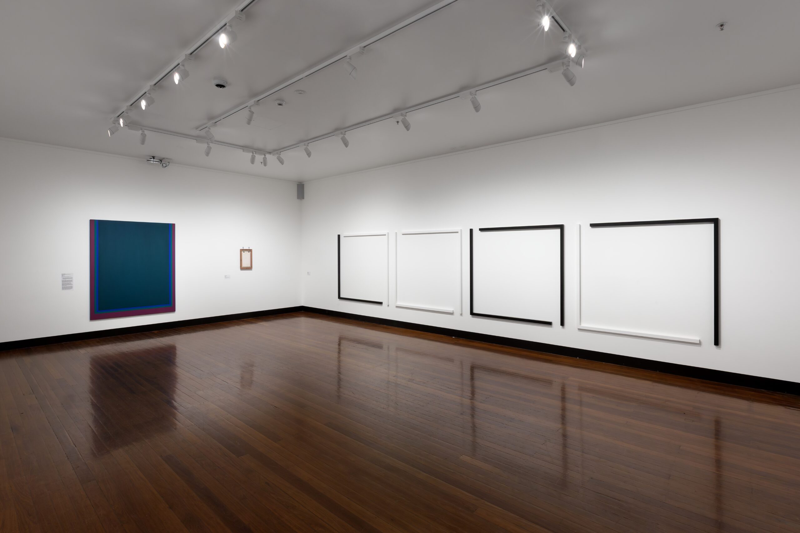
David Aspden, Window II, 1966, acrylic on canvas, 180 x 150 x 3.2 cm. ANU Art Collection. Donated through the Australian Government’s Cultural Gifts Program by Karen Aspden in memory of David Aspden, 2023
Nov 27, 2025
|
Collection
—
Soft-touch geometry
Written by Lucy Chetcuti
—
“What painting wants more than anything else is Working Space – space to grow with and expand into, pictorial space that is capable of direction and movement, pictorial space that encourages unlimited orientation and extension.” – Frank Stella
David Aspden hails from the heyday of ‘New Abstraction’ that cemented its presence in Australia in the 1960s and 70s. Aspden exhibited in the landmark exhibition The Field, held in Melbourne and Sydney in 1968, alongside contemporaries Dick Watkins, Janet Dawson, John Peart, Sydney Ball, Wendy Paramor, Nigel Lendon, and Micheal Johnson among others. Although initially divisive in its reception, The Field was a crucial turning point in the establishment of abstraction in Australia, heralding in the ‘new’ and the ‘cool’ of American art that was taking the world by storm.
Born in Bolton, England in 1935, Aspden migrated to Wollongong, Australia in 1950, where he lived, exhibited and worked as a commercial sign writer for many years. Although he never attended art school, his training in commercial painting and basic design was foundational to his iconic colour field and hard-edge abstractions that were shown in Sydney galleries throughout the 1970s.
In Aspden’s early works, the core elements of colour, shape, form and line, are harmoniously unified to create an internal logic. Exemplary works such as Untitled 1968 demonstrate his sensitivity in mastering tonal variation of base colours to ‘push’ and ‘pull’ within the internal space of the canvas. Burgundy, mauve, yellow, and a combination of cool and warm reds have been applied to the canvas in slanted and parallel geometric blocks. Aspen assigned minute shifts of tone and density to blocks of the same hue – of reds, oranges and purples – and with careful placement alludes to a stacking of shapes ‘in front’ or ‘behind’ the foreground. The shifting tonality and geometric triangulation results in an image that appears to fold within the boundaries of the canvas. Using simple design principles and working at a particular scale, Aspden creates a relationship to the indexation of the human body.
His flavour of abstraction may have been touted as ‘cool’, yet it manages to resist the theoretical coldness of much of 1960s minimalism. His hard-edge abstractions maintain a ‘softness’ due to the treatment of his edges and lines. He is not presenting fixed rigid planes, but rather geometric shapes which are softened with subtle irregularities – remnants of pencil guidelines and paint bleeds over the edge which lend to an overall sensitivity within the works. Surface is also key. Untitled 1968, appears to have been painted onto an unprimed surface, allowing the canvas to absorb the first layers of paint. The result is a vibrant and delicate surface which invites the eye to rest comfortably. This softness is evidence of the maker’s hand which ultimately humanises and creates a connection between the artist and the viewer.
“…the formal considerations of painting are very important but more and more, I think the paintings I am doing now although they aren’t portraits of anything, they are pictures from life, in other words I am becoming more aware of everything around me.”1 – David Aspden
Although consistently non-objective, Aspden also explored popular Modernist motifs such as the window, enabling him to expand spatial allusion on a two-dimensional plane. This sense of space is evident in Window II 1966, held in the ANU Art Collection. A harmonious palette of blue, dark turquoise and emerald-green generate colour vibrations at the edge where each colour meets – an effect that cannot be truly captured in a photograph. Aspden realizes the greatest use of space through flat colour – applied in many careful, thin layers. The edges of his lines reveal the material reality of the work with small bleeds and irregularities occurring along perfectly straight edges. Like most colour fields, this work is an experience to ponder in relation to the body and the viewer’s field of vision. Standing directly in front of this work, a liminal space opens – a space through which one could enter into infinite possibilities or quiet contemplation.
Aspden’s interest in exploring space as a subject to his painting became more literal in later years, during which he referenced planetary systems, the expansion of the universe and our galaxies. In these works, colour interaction was his primary tool. He developed the technique of pouring paint onto wet canvas to form organic ‘colour-structures’ as can be seen in Nebula 1973. Aspden aspired to sublime affect traditionally associated with landscape painting, which he achieved by evoking a “spatial feeling”. Nebula captures this sense of the sublime by emphasising the materiality of water, which creates an overall visual connection to the elements of the natural world. Organic and spontaneous pools of paint form on the unprimed canvas, revealing streams between puddles of colour, splatters and droplets that can be likened to distant clusters of stars, planetary wind and dust – the unending void of deep space. Aspden’s varied scale of mark creates these spatial allusions, many of which are soaked into the surface of the canvas.
Colour remained a central focus of Aspden’s work throughout his practicing years. Colour rhythm, explained as a dark/light relationship and one colour working against another was something he often discussed when talking about his work;
“…you can eradicate the feeling of dark and light in a certain way so that the colours work against one another, and according to [colour] keys you can get a different general feeling of sharpness and liveliness or perhaps calmness and so on.”2 – David Aspden
In Nebula, contrasting colour relationships of blacks, purples, mauves, ochres and yellows underpin the entire palette. Here the colour-structure operates as it would in a landscape painting in which the colour of the light is yellow, and the correlating shadows are in purple tones. Nebula is an abstraction which gives an affect of ‘real-world’ physical space and the radiant yellow light of a thousand burning stars.
Aspden’s practical understanding of design principles and personal observations of the natural world around him are equally important in our understanding of his work and the power of a soft touch. Both equip him with the ability to address the potential of the two-dimensional plane as an expansive space. Untitled 1968, Window II, and Nebula 1973 have recently been donated to the ANU Art Collection through the Australian Cultural Gifts Program by Karen Aspden in memory of David Aspden.
—
Window II is currently showing in ANU Art Collection: Conjunction, 24 October – 21 December 2025
—
1 David Aspden Interviewed by Hazel de Berg in the Hazel de Berg Collection [Sound Recording]
2 David Aspden Interviewed by Hazel de Berg in the Hazel de Berg Collection [Sound Recording]
The Drill Hall Gallery acknowledges the Ngunnawal and Ngambri peoples, the traditional custodians of the Canberra region, and recognises their continuous connection to culture, community and Country.
Contact
Close
Subscribe
Close
Close