Menu
Close
Spare Room 33 Essay #1
Joseph Kosuth, Modus Operandi, 15/10/88 – 20/11/88
May 9, 2025
|
Features
In the smallest room of their unassuming Western Creek home, local collectors Susan Taylor and Peter Jones present a regular program of exhibitions under the banner of Spare Room 33. Rigorously researched and curated, diligently compiled and considered, the program connects visitors directly to a network of international art historical discourses. Over the coming weeks the Drill Hall Gallery will publish a selection of Peter and Susan’s accessible and informed essays that accompany each of their exhibitions.
First up is the essay from Susan and Peter’s initiating Spare Room 33 exhibition. This exhibition, displayed in April 2013, set the projects enduring course. Bringing together fifteen standard format, artist-designed exhibition posters by Carl Andre, Franz Erard Walther, Joseph Kosuth, Gerhard Merz, Bas Jan Ader, Giovanni Anselmo and Karl Wiebke, the exhibition documented the program of the Kabinett für aktuelle Kunst in Bremerhaven from 1972-1988. The posters are currently on display at the Drill Hall Gallery as part of Eye to Eye: The Susan Taylor and Peter Jones Collection.
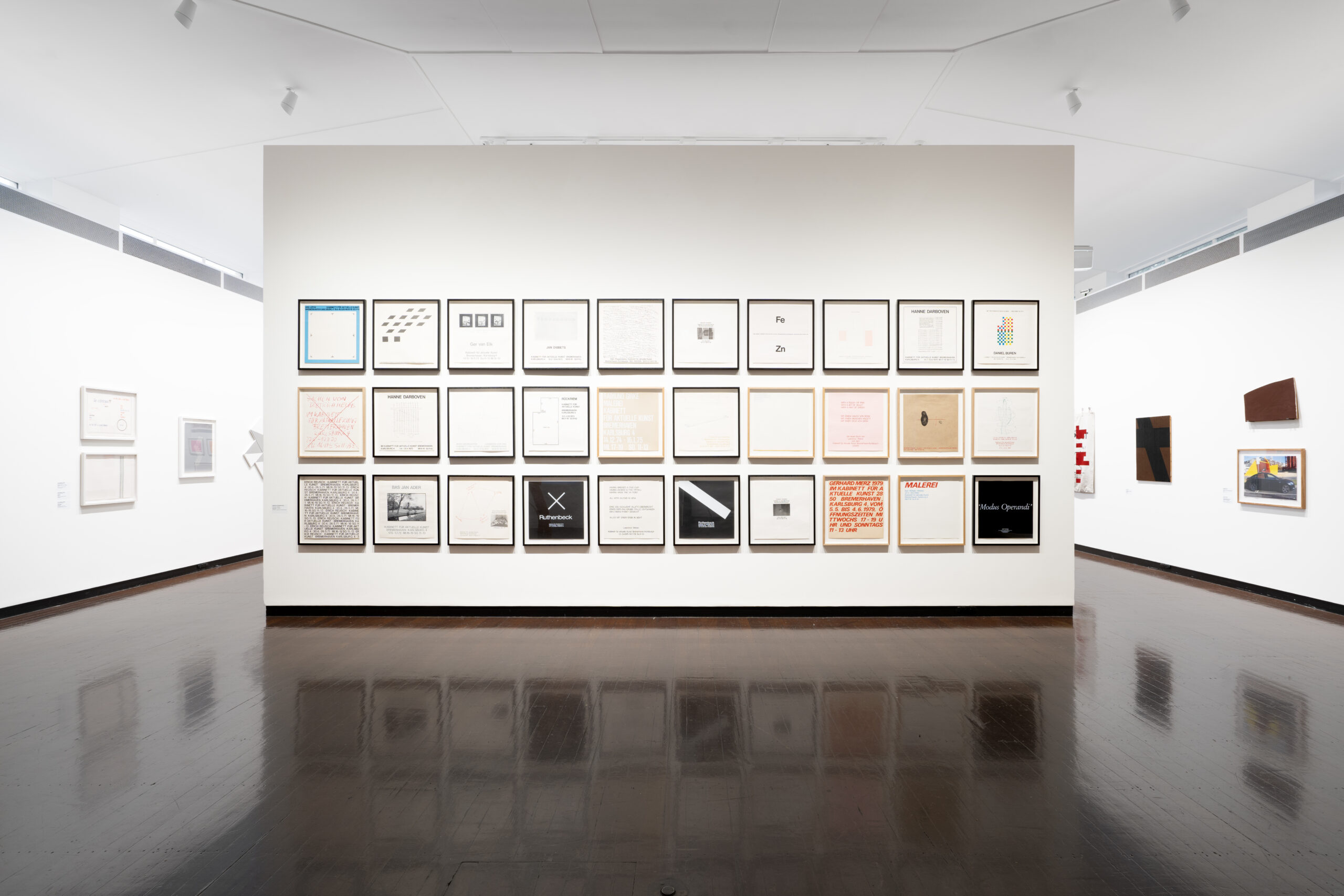
SPARE ROOM 33 SHEET #1
15 exhibition posters from the Kabinett für aktuelle kunst, Bremerhaven, 1972–1988
The Kabinett
The Kabinett für aktuelle Kunst in Bremerhaven was an exemplary space for artists at the cutting edge of innovation in conceptual art in all its forms in the 1970’s and 1980’s. Apart from a stellar line-up of exhibiting artists, the Kabinett director, Jürgen Wesseler, helped secure the legacy of his gallery through a consistent approach to documenting its exhibitions. One form of this was to take a standard photo of each exhibition from outside the gallery, looking through its shopfront window to the installation within, establishing a powerful sequence of images that can be seen in various publications, such as the catalogue of the 1992 retrospective Vorhut aus dem Hinterland (trans: Vanguard from the Back Country). Wesseler also invited exhibiting artists to design a poster for their exhibition in a standard square format of 48 x 50 cms, and screenprinted the posters in a limited edition of 50 using equipment on site. This exhibition presents fifteen of those posters.
The artists
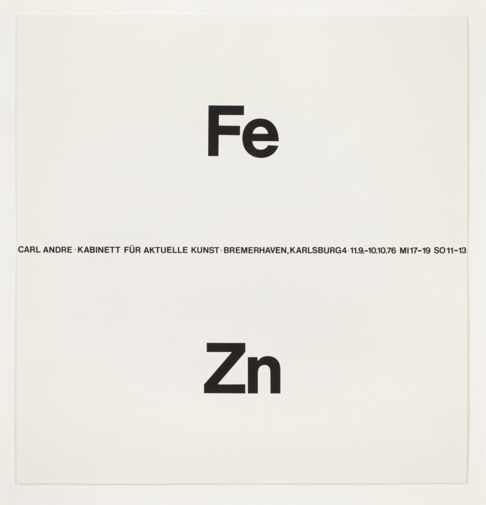
The posters in the exhibition represent a good cross-section of the European and American artists who were invited to exhibit at the Kabinett. A key development associated with conceptual art in the 1960’s was the reconsideration of sculptural forms. Carl Andre reoriented sculpture to a horizontal plane, in linear sculptures flat on the floor, assembled from various metals, unwelded and unjoined. His exhibition at the Kabinett in 1976 showed an example of these works, composed of plates of iron and zinc. Andre has commented: ‘The periodic table of elements is for me what the colour spectrum is for the painter.’ Andre’s floor works were meant to be accessible to viewers, and walking on them (in appropriate footwear) was not discouraged.
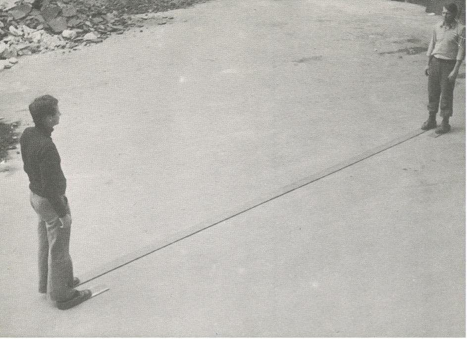
Franz Erhard Walther took viewer involvement to another level in his sculptural practice, in that the viewer became the user of a set of material components created by the artist, and it was that use, through their handling and interaction with those components, that constituted the artwork. The material components of each work were designed and placed by Walther to determine how a user activated the work and their relationship with other users. The poster for his 1975 exhibition shows Walther’s design and measurements for a floor bracket that positions a person at either end facing each other at a fixed distance. The invitation card for the exhibition was a photograph of this sculpture in use. Walther exhibited at the Kabinett five times between 1973 and 1984.
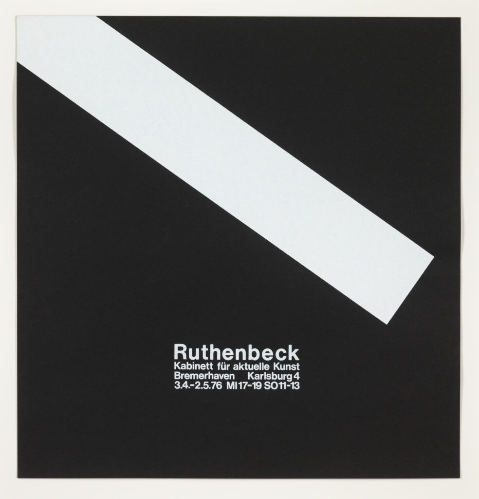
Walther’s compatriot Reiner Ruthenbeck utilised a range of materials, including paper, fabric, felt, metal, ash and slag, in his sculptural installations. The common thread in these was Ruthenbeck’s manipulation of such mundane materials to reveal their essential properties, using various methods including: re-ordering or condensing a material into a new form; creating a specific, often geometric, relationship between a material and the exhibition space in which it was installed; and using a work to overcome the assumed incompatibility of the different materials in it. In his first exhibition at the Kabinett in 1971, Ruthenbeck showed an installation of tipped over and upside down domestic furniture, effectively neutralising their function to enable a focus on their essential form. For his third exhibition at the Kabinett in 1976, it appears that he threw a metal beam at an angle across the width of the room. His poster for that show is an uncompromising piece of geometric abstraction, with a white oblong form angled across a black ground.
An even more radical reinterpretation of sculpture in the late 60’s was Lawrence Weiner’s idea that language could function as sculptural material, and that the existence of a language-based work of art no longer depended on its construction. In his famous statement of intent in 1968, Weiner’s third proposition was that the piece need not be built. Weiner’s various text works, or statements, do not depend on their site to provide context for them. They are hard to get a handle on, purposely bewildering the viewer in their absence of a subject and any instruction, their isolation and their refusal to act as a metaphor for something else: the work is what it is.
The Joseph Kosuth poster in the exhibition is also a text piece. Kosuth’s conceptual practice is a complex and often obscure interrogation of, and commentary on, the process of art making. Over a number of years from the mid 1980’s, he exhibited the words ‘Modus Operandi’ (definition: the way a thing operates) in a variety of environments, as a means of highlighting the presentational strategies of art. Unlike Weiner’s non-site specific texts, the presentational context of each ‘Modus Operandi’ installation is essential to its purpose. Presentational contexts have even included the reproduction of ‘Modus Operandi’ on a series of limited edition Illy espresso coffee cups. Hanne Darboven used text, handwritten on sheets of paper, as her medium, but in her case, her written numbers and symbols eliminated any description, narrative and meaning in a linguistic sense. Darboven falls squarely within the ‘process’ family of conceptual artists. Sol Lewitt was an early, critical influence. In her works, she shares with other conceptual artists Roman Opalka and On Kawara a thematic obsession with presenting a visualisation of the flow of time. Initially, in her ‘calendar’ works, she systematically converted dates (day, month, year) into a numeric value by adding their digits together to produce a Konstruction or ‘K’ number. As the 70’s progressed, she included external texts as reference points, and began to mark the passage of units of time with a lower case ‘l’ symbol, written cursively and producing a wave effect. These features of Darboven’s practice are evident in her 1979 Kabinett poster, which works off the date of the storming of the Bastille and the opening date of her exhibition, both 14 July.
Time is more of a tool than a theme in the work of Karl Wiebke, in his paintings that are built over several years from multiple layers of paint applied and carved back, and the ones that are left outside in the elements as the seasons pass, inviting the weather to sculpt the painted surface. Trained and working originally as a goldsmith, Wiebke gave that up to study art in Hamburg under Franz Erhard Walther. His first solo exhibition at the Kabinett in 1977 showed his ‘flag’ series of paper strips dipped in pigment. His second show in 1980 was of his first series of painted sticks, inspired by the spines of his vinyl LPs, that has been a feature of his practice to the present. Each of Karl’s sticks is a painting in its own right. He has commented that a painting on a stick has no foreground, no background, no top or bottom and thus is free of any art historical issues. The sticks were leant against the wall to allow the paint to dry, and this practical function then became their means of showing. Karl moved to Australia in 1981 after his second Kabinett show. Seven of the posters in this exhibition, including his own, were gifted to us by Karl, and we acknowledge and thank him for his generosity and contribution to this project.
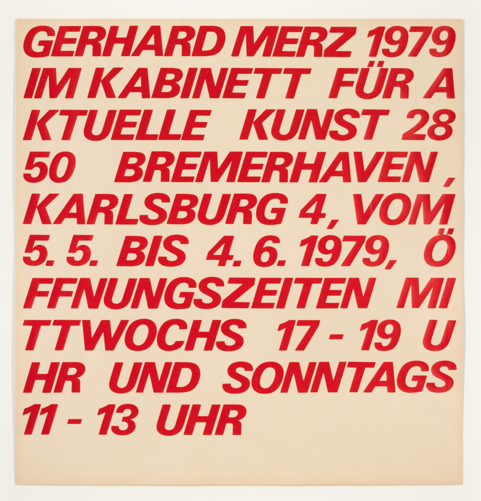
The remaining two German artists represented by posters in the exhibition showed at the Kabinett on multiple occasions. Gerhard Merz has a reputation for transforming gallery spaces into precise architectural environments. In many cases, the room itself takes on a sculptural volume. Merz’s poster image is a plan of the Kabinett space, showing the positioning of two large works on the opposite walls of the room. Raimund Girke denied he was a conceptual artist (as most of them did) stating that he did not want ‘to sacrifice painting for an idea’. Notwithstanding this comment, Girke used his painting to investigate a number of fundamental concepts in art, such as the relationship between subjective and objective, and physical phenomena such as light and vibration. In a long career beginning in the 1950’s, Girke progressively reduced his colour palette to predominantly white, observing that ‘white is limitless, dimensional space.’
The Netherlands produced a number of artists in the vanguard of minimal and conceptual art in the 1960’s and 1970’s. Of these, Ger van Elk is distinctive for his wit. It is hard not to smile at works like The Co-Founder of the Word OK, where van Elk photographs himself shaping his body to form the ‘K’, and the ‘O’ is variously portrayed by a painting of a coil of rope, or a loop of sausage suspended from a stick held over his shoulder. Or the film The Flattening of the Brook’s Surface, where the artist is seen sitting in a small rubber dinghy attempting to smooth out with a trowel the ripples on the water’s surface created by his craft. The poster for his 1972 show at the Kabinett shows three stills from a video projection titled The Rose is more Beautiful than Art, but Difficult, therefore Art is Splendid. In this film, a seeming still-life painting of a vase of flowers is projected, only to have the artist’s hand disrupt and contradict the still-life by entering the frame to rearrange the flowers.
Van Elk’s friend and compatriot, Bas Jan Ader, similarly played with the Dutch tradition of still-life painting and of flowers as a Dutch cultural cliché, as well as referencing Mondrian and de Stijl, by filming himself seemingly randomly removing and replacing yellow, red and blue flowers in a vase until an end point is reached where the vase is filled only by flowers of a single primary colour. In 1975, Ader set out from the US to cross the Atlantic in a tiny 13 foot sailboat as part of a transcontinental artwork called In Search of the Miraculous. He was never seen again. One of the intentions of the first generation of conceptual artists like Ader was to highlight things usually taken for granted, as in Darboven, Opalka and Kawara’s expressions of the passage of time. Ader made several brief films to show how, as he said, ‘gravity made itself master over me.’ Broken Fall (Organic), the subject of his 1972 show at the Kabinett, is the best of these funny, original, memorable films, and is suspenseful in every sense of the word. For an agonising minute and a half, Ader hangs from a tree branch, 25 feet in the air, trying to hang on, wriggling at times to redistribute his weight, other times hanging motionless and seeming to be stretched groundward by gravitational pull. Then, abruptly, his grip breaks and he falls into the stream below. The tipped-in photograph on the Kabinett poster is a still image from this film taken a fraction of a second after Ader has lost his grip on the branch.
Giovanni Anselmo is best known for his association with the arte povera group of artists. The photograph of Anselmo’s 1975 exhibition at the Kabinett shows a number of projectors on the floor of the room and one on a plinth. What they were projecting on adjacent surfaces, and onto anything that passed through the projected light beam, was the word ‘particolare’, which translates as ‘detail’, the point being to heighten one’s awareness that any component of an object exists in its own right. Furthermore, the beam of light itself is immaterial, and the word and meaning carried by it non-existent, until activated by a surface positioned or passing in front of it. The exhibition poster shows photographs of three activations of the word.
The posters as artworks
Beyond their merits as examples of fine graphic design, a number of the Kabinett posters directly incorporate, more than just reproduce, artistic content, and give direct access to the artist’s practice. This is particularly so in the case of Lawrence Weiner, where a screenprinted poster is as valid a location for the execution of his text statements as any other surface, and there is therefore no division between the poster and an artwork – the posters are artworks. Karl Wiebke’s poster for his first exhibition uses the same method as the artworks exhibited, with both the poster and the invitation card being dipped into pigment to create a borderline of colour running along the bottom edge of each.
In the case of Bas Jan Ader, his works are so few and rare that his two Kabinett posters are recognised as part of his catalogue raisonné. More than that, though, the Kabinett poster was the only medium in which the photographic still from Broken Fall (Organic) was used, until a limited edition of the same photograph was issued under the official auspices of Ader’s estate in 1994.
Finally, Carl Andre’s poster design symbolically represents his exhibited sculpture, with the periodic table of elements symbols for the materials used – iron and zinc – positioned in each hemisphere. In its elegance and the integrity of its visual representation of the sculptural work in another medium, the poster harks back to Andre’s mid-60’s concrete poetry practice, and stands as a fine example of a concrete poetry poster poem or broadside in its own right.
Peter Jones and Susan Taylor
Spare Room 33
April 2013
Note: The content of this room sheet draws on ideas and references from multiple published sources, combined with the authors’ commentary, in order to give a necessarily brief impression of the work of each artist. It is also acknowledged that an artist’s practice cannot be fully comprehended in a single paragraph précis, and that significant parts of each artist’s body of work have not been mentioned.
For events and programs related to Eye to Eye: The Susan Taylor and Peter Jones Collection please see our website dhg.anu.edu.au
The Drill Hall Gallery acknowledges the Ngunnawal and Ngambri peoples, the traditional custodians of the Canberra region, and recognises their continuous connection to culture, community and Country.
Contact
Close
Subscribe
Close
Close